11 Questions About Button Design
Buttons are crucial elements of almost any user interface. They allow users to take action. Pages, dialogs, input forms, toolbars - all those components require buttons.
In this article, I want to review the most common questions that visual designers have about button design.
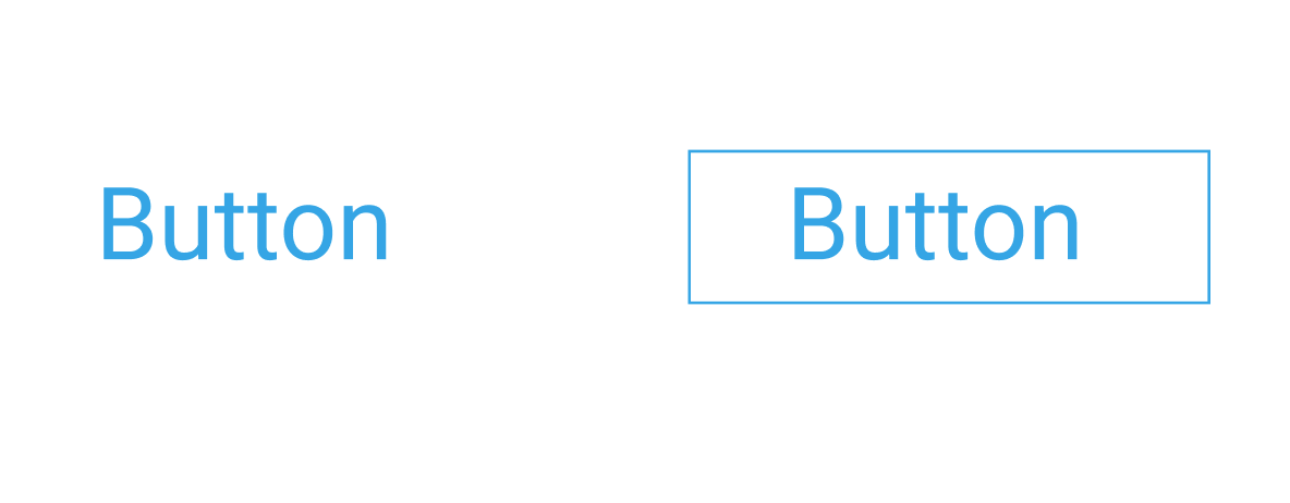
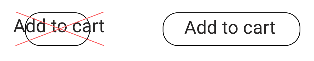
1. Can I design buttons without a border?
The foundational rule of good button design is simple - buttons should look like buttons. Border reinforces the feeling of a traditional button and creates an eye-catching target for the user. Without a border, the UI element looks more like a link rather button. That's why if you have a choice, it's safer to use a visible border.
2. What color should I choose for buttons?
Colors are an essential part of the visual language we use to communicate with our users.
Here are a couple of things to remember when selecting colors:
Contrasting colors make it easier to spot the button in a layout.
But no matter what colors you choose to use, ensure that colors are accessible by everyone who will use your product.
3. Should I use round or sharp-edged buttons?
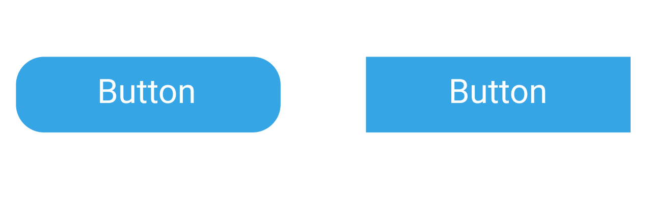
- Round shape is more pleasing for the human eye. Humans naturally tend to avoid sharp objects, and some people even have aichmophobia (fear of sharp things, such as pencils, needles, knives).
- Round shape directs the user's focus towards the center of the button, where the text label is located. As a result, you have a better chance user will read the label.
But when it comes to design decisions, the shape of the button should be selected according to the visual design of your product. If the visual design uses a lot of strict geometric objects, that you should probably use sharp-edged buttons.
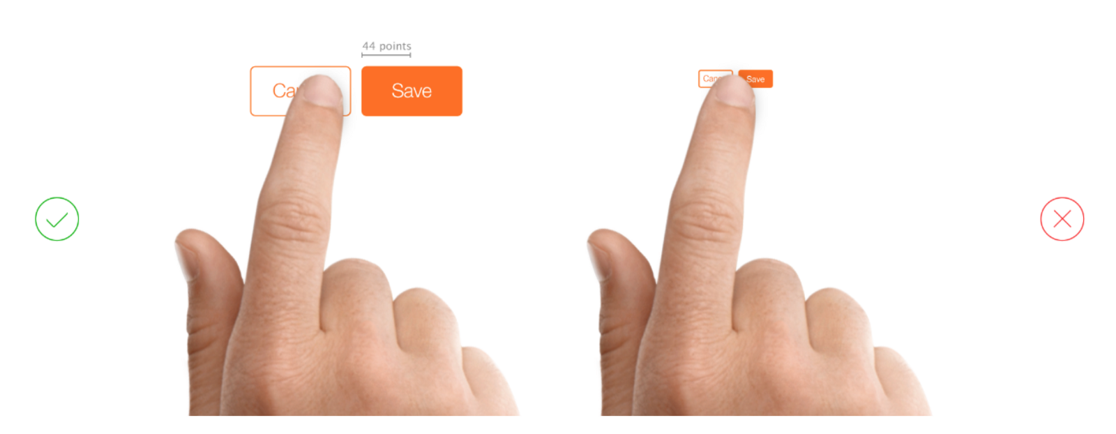
4. How large/small should I make buttons?
The goal is to make the interaction with UI comfortable for users. It means that you need to design all UI elements to minimize the risk of incorrect action. The size of the buttons should:
- Make it easier for users to read the label (legible and readable text labels). It's vital to choose a typeface that works well in multiple sizes and weights to maintain readability in every size (check that the font you choose is legible on smaller screens!)
- Make it easier for users to interact with the UI element (easy to click/tap). This point is especially important for touch interfaces because small touch targets increase the risk of incorrect action. It's recommended to create controls that have a size 9 mm so they can be accurately tapped with a finger. Such targets allow the user's finger to fit snugly inside the target.
5. When to use filled vs. ghost buttons?
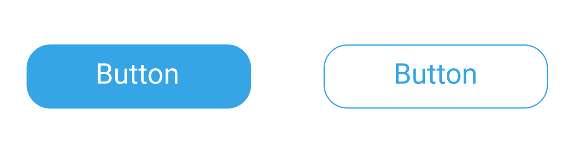
Ghost buttons (also known as hollow buttons) became trendy in recent years. They are particularly common for landing pages. But when it comes to user experience, it's important to remember that ghost buttons are much less effective for capturing user attention (since they have less visual weight).
That's why the choice of ghost vs. filled buttons should be based on the level of emphasis you want to have for your buttons. Generally, filled buttons are used for high emphasis due to more color contrast. For the very same reason, it's not recommended to use a ghost button as a primary call to action button.
Sometimes you need to show two call-to-action buttons side by side. In this case, filled button should be for primary CTA while the hollow button for the secondary action. This high-emphasis button commands the most attention while the ghost will be used as an alternative.
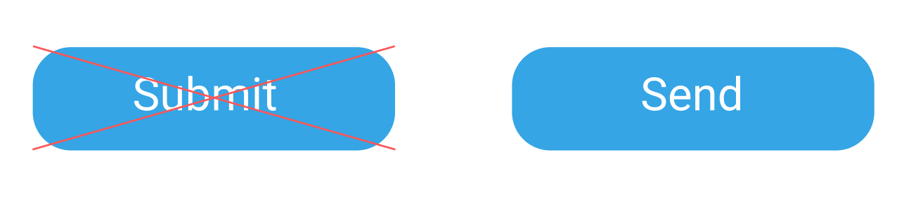
6. How to write a good text label?
Text labels describe the action that will occur if a user taps a button. Most designers know that button's action should be clear to users.
Good labels are actionable. They prompt the user to complete a certain action by saying what will happen when a user click/tap on it. That's why it's recommended to use verbs (i.e., Send, Get, Apply) to that clearly describe the operation. For example, when your user is going to send an email, design button with the label "Send" instead of "Submit."
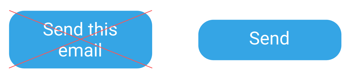
7. How much text can I use for labels in buttons?
Sometimes designers go overboard with the number of words in text labels. While more words might mean more clarity, more words also mean more visual clutter.
Here are two things to remember:
Avoid wrapping text. To keep text legible a text label should remain on a single line.
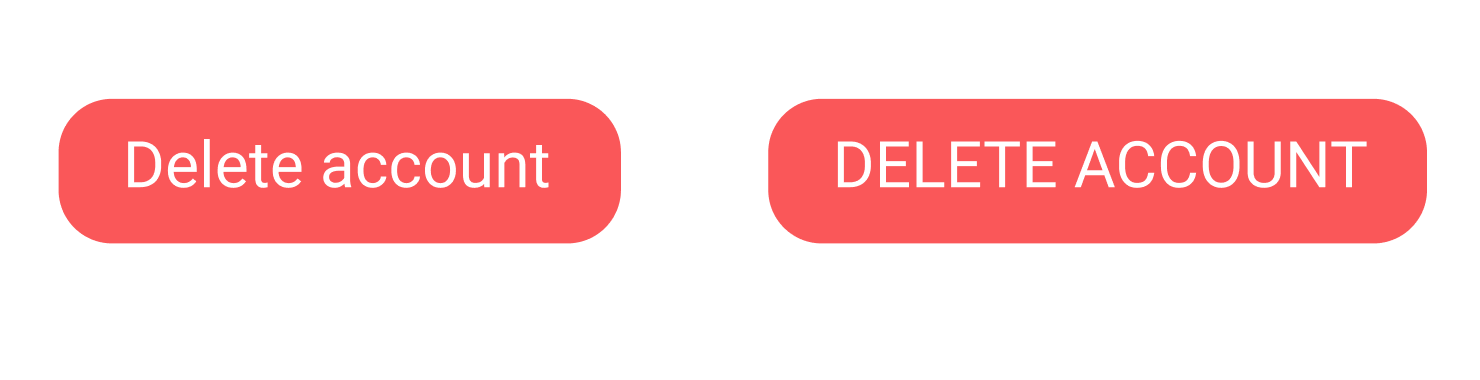
8. Can I use ALL CAPS for text labels?
Designers tend to avoid using ALL CAPS for text for two apparent reasons:
- ALL CAPS makes text difficult to read and comprehend. Both headings and regular text are less legible when typed in all upper letters. Headlines in all capital letters take between 13% and 20% longer to read (study by Breland, K., & Breland)
- ALL CAPS creates an impression of yelling on your users. People don't like read instructions in all capital letters because they feel like the other person is teaching them how to do things properly.
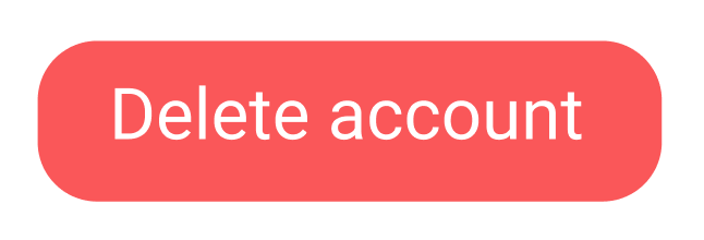
But what about button labels? ALL CAPS naturally demands more attention from the user, and it's possible to use ALL CAPS for button labels when you want users to avoid making mistakes while performing a particular action (i.e., deleting an important file).
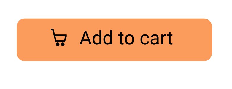
9. Can I replace the text label with an icon?
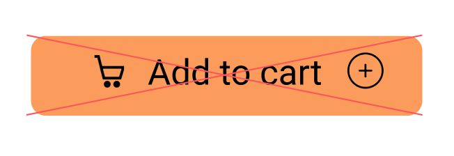
Yes, you can, but only if the icon has a universal meaning (such as home, print, share, or shopping cart). For other icons, you need to ensure that your users can decode the meaning of your icons. If the meaning isn't clear for users, you can use icons along with text to communicate the meaning. The icon will naturally call attention to a button object while the text label will clarify the meaning of this button.
But do not use two icons in the same button.
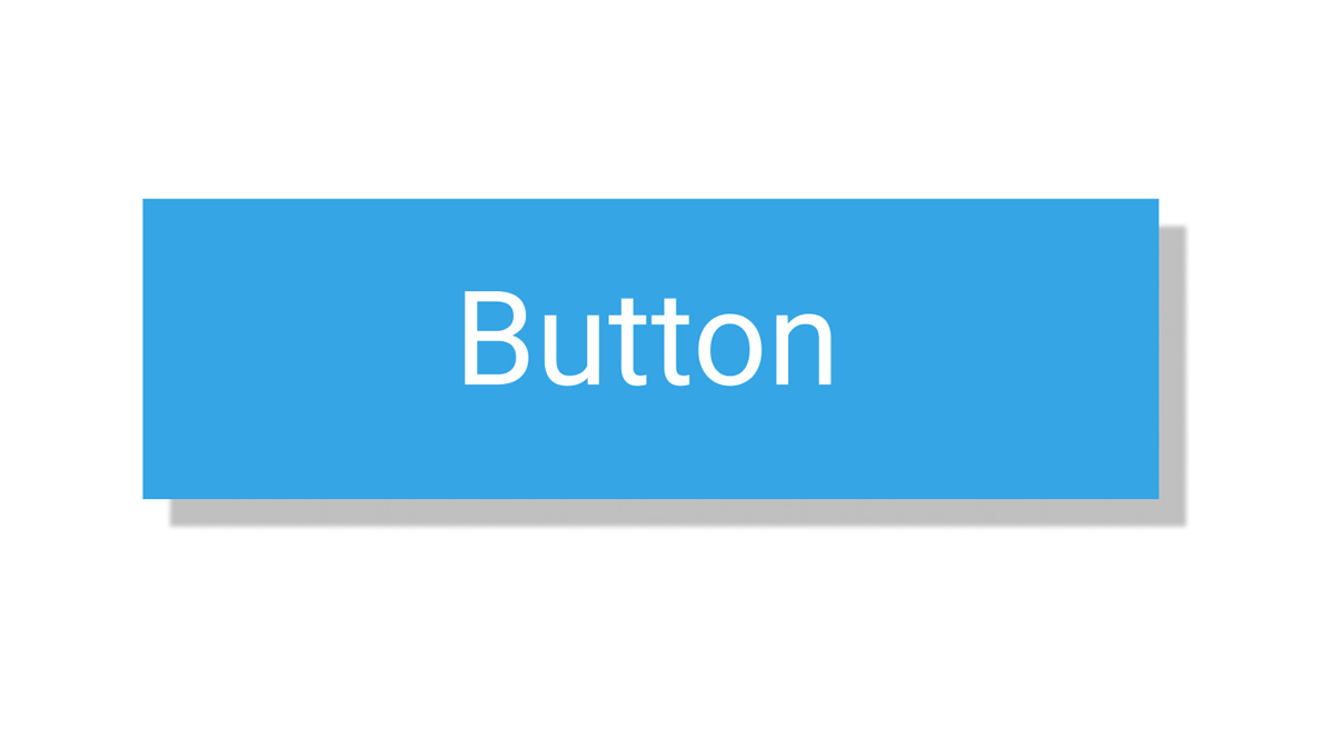
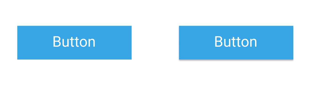
10. Should I use shadows for buttons?
Generally, shadows will help you increase the visual prominence of a button and put more emphasis on it. But ultimately, a decision whether you want to use shadows for buttons should be based on the style of your user interfaces. If the majority of UI elements are flat, probably you shouldn't use shadows for your buttons.
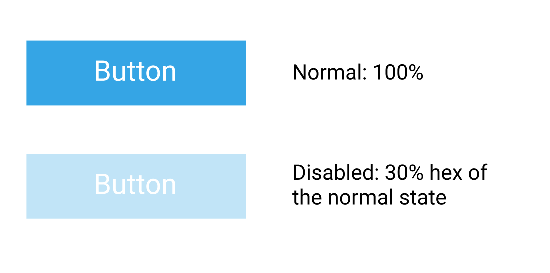
11. How can I communicate a state of a button?
Not only a button's action should be clear for the user, you also need to ensure that the state is clear. Typically, it's possible to define the following states of a button:
- Normal (Active). The active state is when a button is clickable/tappable.
- Hover (desktop-only). This extra state can reassure the user that a certain element is interactive.
- Pressed. Button's visual design acknowledges that the user clicked/tapped the button.
- Disabled. The button can be disabled when the user hasn't completed the necessary operations.
Color and opacity can be used to communicate the state.