
30 Things We Often Forget When Designing Mobile Apps
This article is a memo that will remind you about the things you need to design before sending your app to AppStore/GooglePlay. The list is divided into a few important sections:
- I. Login / Sign up
- II. First-time experience
- III. Daily interactions
- IV. Notifications
- V. Account settings
- VI. Feed
- VII. Search
- VIII. AppStore/GooglePlay
I. Login /Sign up
1. Splash screen
Splash screen is the screen that shows up when users launch a mobile app. Since the splash screen is the first screen the users see, it creates the first impression for users even before they start using your app.

Here are a few tips on how to design a good splash screen.
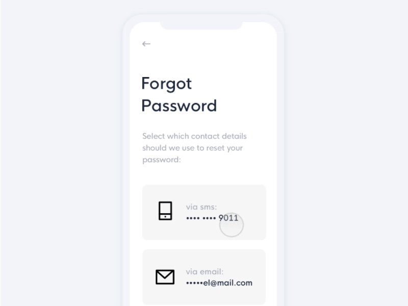
2. Forgot password flow
The average person is registered to 90 online services that require passwords. With so many accounts in use, very few people remember their passwords. According to statistics, 21 of users forget passwords after two weeks, and 25 percent forget one password at least once a day. If your app requires log in, then you should provide an option to reset the password.
II. First-time experience
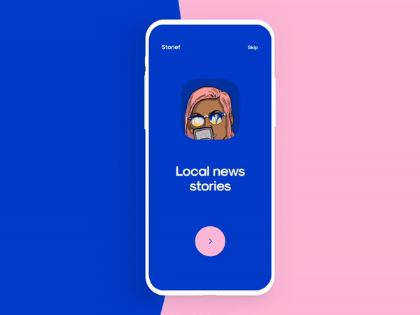
3. Onboarding screens
Onboarding is a term used by UX designers to describe a process of getting users "up and running" with an app. Successful onboarding increases the likelihood that a first-time user becomes a full-time user after adopting a product.
Here are some practical tips on how to approach onboarding for mobile apps
And here are a few creative concepts for mobile onboarding.
4. Data confirmation screens
Many mobile apps ask to confirm email/phone number. Data confirmation screen usually comes after a user provides the required details and tells them to go and confirm their email address/phone number.
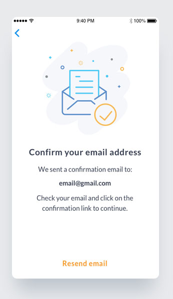
For data confirmation screens, it's vital to provide:
- An option to resend the confirmation code (for mobile phone numbers)
- Instructions on how to find the confirmation message (i.e. search for a particular title, search in Spam folder, etc.) (for email confirmation message)
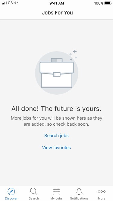
5. Empty states for "No content yet"
Content is what provides value for most apps. It's the primary reason why people are using them - for the content. Thus, it's critical to consider how to design places in the user journey where a user might not have content yet. Such places are known as empty states, and empty states shouldn't be…well, empty. An empty state is a natural point to inject some onboarding to continue guiding users along. Instead of leaving it blank, you should use it efficiently - to educate and guide.
6. Default user avatar
A majority of users (~95% according to Jared M. Spool) do not change default settings. It means that a majority of users will have a default avatar that you will select for them.

Here are a few ideas on how to design a better default avatar.
III. Daily experience
7. Permission requests screens
When users open a new app, the last thing they want to see is multiple popups in a row asking for permissions:
- App Would Like to Access Your Locations
- App Would Like Access Your Contacts
- App Would Like to Access Your Camera
Such permission requests have a very negative impact on user experience and usually leads to the app abandonment. That's why it's much better to ask permissions in the content of user interactions.
Check this article for the tips on how to ask for permissions
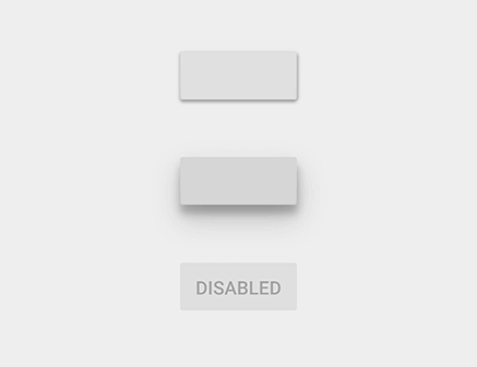
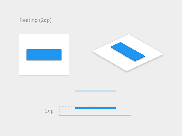
8. Various states for interactive UI elements
Buttons and other interactive elements often have multiple states. It's vital to consider states like Default/Pressed/Disabled for every interactive element you have in your app.
Check this article for more tips on how to design buttons.
9. Icons set
It's possible to make your UI more visually consistent by using icons with the same style.

Here is a simple checklist for using icons in design.
10. Error states
We all know that the best error message is the one that never shows up. It is always better to prevent errors from happening in the first place by guiding users in the right direction ahead of time. But, when errors do arise, well-designed error handling not only helps teach users how to use the app as you intended but also prevents users from feeling ignorant.
Here are a few error cases that you should design for:
- No internet connection. Consider what users see when they don't have an internet connection.
- Incorrect user input.
- System error.
Here is an article with practical recommendations on how to design great error states.
11. Loading states
While an instant response from an app is the best, there are times when your app won't be able to comply with the guidelines for speed. A bad internet connection could cause a slow response, or operation itself can take a long time. For such cases, to minimize user tension, you must reassure users that the app is working on their request. When an app fails to notify users that it's taking time to complete an action, users often think the app didn't receive the request, and they try again. Plenty of extra taps have resulted due to a lack of feedback.
A wait-animation progress indicator is the most common form of providing a system status for users when something is happening or loading.

Here are ten creating loading indicators for your inspiration
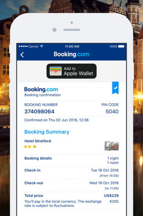
12. Success states
Success states are screens that we show to users when they complete tasks. Designers should consider the following types of success states:
- Delightful states (first-time success). The moment a user completes an important task for the first time is an excellent opportunity for you to create a positive emotional connection between them and your product. Let your users know that they are doing great by acknowledging their progress and celebrate success together with the user.
- Confirmation screen. A confirmation screen is a must-have screen for e-commerce apps. The moment when the user completes the purchase, we need to show a screen that will provide all essential details about the purchase.
13. Autocomplete
Designers should always strive to minimize the interaction cost by removing unnecessary actions. Autocomplete simplifies user input by reducing the number of taps the user has to make in order to fill out the query.
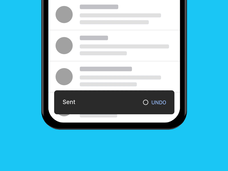
14. Undo actions
We all make mistakes, but when it comes to user experience, it is vital to provide an option that helps the user to recover important data.
15. Localization/Internationalization
Since many product teams have plans for global reach, it's vital to make localization/internationalization a natural part of the design process. The visual properties of elements (such as size) and UX copy should be selected with localization/internationalization in mind.
16. Help docs
When users have a problem, their first natural reaction will be to search for a solution within the app. That's why it's a good idea to provide a link to the Help/FAQ section in app.
17. Accessibility
Accessibility enables people with all abilities to perceive, understand, and interact with your product. Here is an excellent summary from Lillian Xiao on what designers need to know about mobile accessibility.
And here is a list of tools for checking color contrast.
IV. Notifications
18. In-app notifications / Push notifications
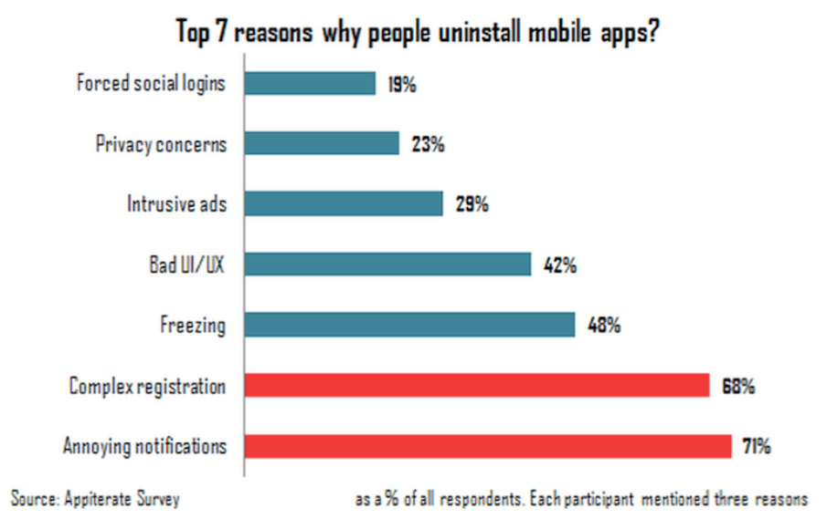
Did you know that lousy-designed notifications are the #1 reason why users uninstall the app?
However, it's possible to turn this anti-UX pattern into something meaningful and useful both for a business and for a user. To achieve good results with in-app notifications, designers need a publishing strategy that best fits mobile medium.
Here is an article that provides information on how to design good notifications.
And here are a few design inspirations for you:
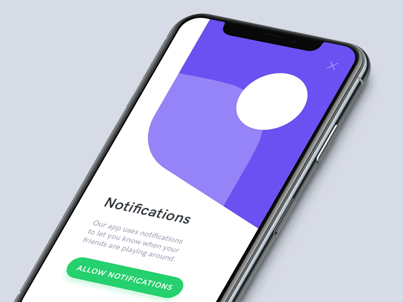
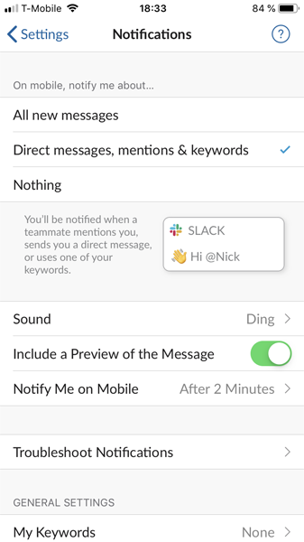
19. Notification preferences
It's always great to provide users a freedom of choice. In the context of mobile notifications, it means providing an opportunity to choose what notifications they want to receive.
V. Account settings
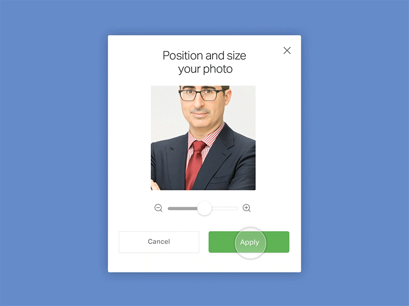
20. Profile photo cropping tool
Allow users not only to upload the avatar but also modify it according to their needs right in your app.
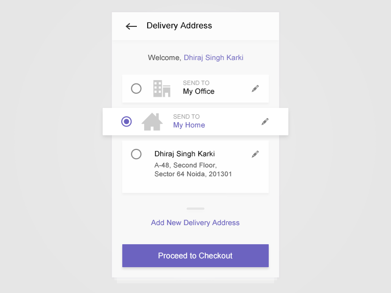
21. Screens for viewing/changing personal details
Allow users to edit their personal information right in the mobile app. Design screens to preview Shipping/Billing info and make this info editable.
22. Logout
If your app requires sign in, you should always allow users to sign out.
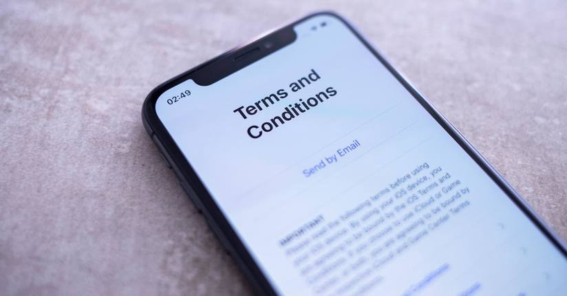
23. Terms of Service
Add Terms of Service to your app to avoid getting sued.
24. Privacy settings
Allow users to see what data they share with a company and allow them to customize the settings.
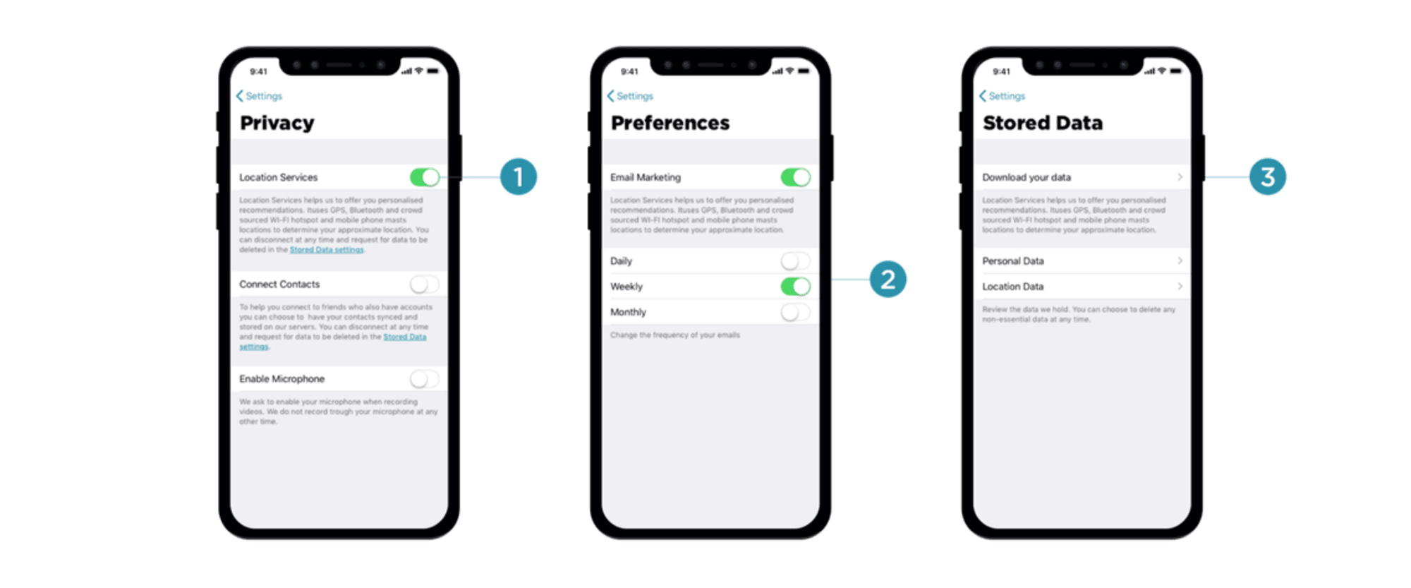
Here is an excellent article on how to deal with privacy in your design.
25. Send feedback
By providing a quick route for sharing feedback about your product, not only you collect valuable insights about your product from real users but also make them believe their feedback is valuable for you.
VI. Feed
26. Scrolling states
Mobile displays have limited screen estate. In order to save screen space, designers often want to optimize the displayed information and hide anything that is not valuable for the user. That's why many feed screens have two states - default state (the screen that users see when they enter the feed) and on-scroll state (when the user swipes up to see more content).
VII. In-app search
27. Default search behavior
You need to decide what will be a default order for the search results. For example, if you design search results page for an e-commerce app, you need to decide whether the output should be sorted by best match/price/delivery time.
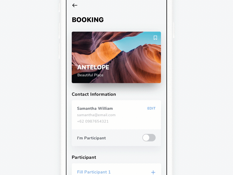
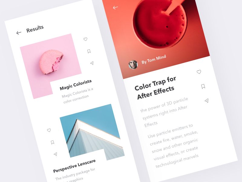
28. Share it/Bookmark it flow
Allow users to share or bookmark a particular item from search results.
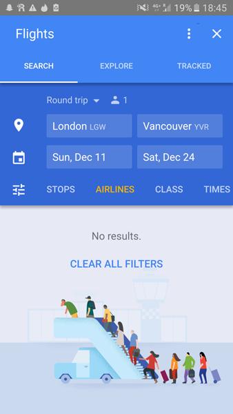
29. Empty states for "No results"
What screen will our users see when they search for a particular item, but the app does not have any matching results. "No results" screen should not act as a dead end. That's why instead of showing a blank page with a quick note "No results," we should design a screen that guides users and shows what they can do next.
VIII. AppStore/GooglePlay
30. App icon
You need to design a memorable icon for your app, something that will reflect the nature of your app and create interest for potential users.