5 Universal Fonts For Web & Mobile Design
Typography is an integral and powerful part of every design. We all know that Content is King And when we select fonts we should remember that a font's primary job is to honor the king - facilitate legibility and create a mood that encourages reading.1. Open Sans
Open Sans is a humanist sans-serif typeface designed by Steve Matteson and commissioned by Google.Open Sans optimized both for print and web. Since this typeface features wide apertures on many letters and a large x-height (tall lower-case letters), it stays highly legible on both large and small screens.
Category: Sans-Serif
Pairs well with: Open sans pairs well with many fonts such as Montserrat, Lato, Brandon Grotesk, and Roboto
Design recommendations: Try 28px for headers and 16px for regular content
Source: Google Fonts
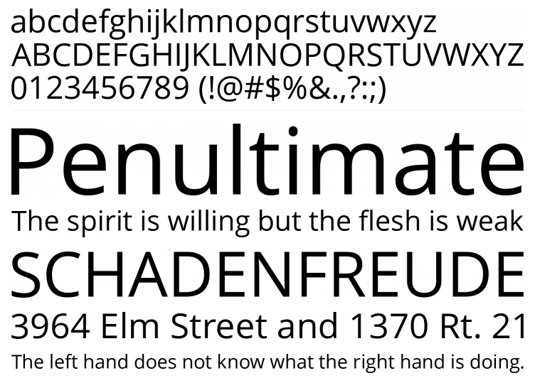
2. Roboto
Roboto has a dual nature. It has a mechanical skeleton and the forms are largely geometric. At the same time, the font features friendly and open curves.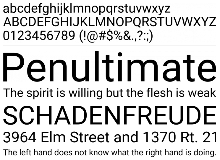
Roboto is the default font on Android and other Google services.
Category: Sans-Serif
Pairs well with: Roboto Slab, Open Sans, Lato, Playfair Display
Design recommendations: Try 21px for regular content
Source: Google Fonts
3. Helvetica
Helvetica is a widely used sans-serif typeface developed in 1957 by Swiss typeface designer Max Miedinger together with Eduard Hoffmann. Notable features of Helvetica are a high x-height, the termination of strokes on horizontal or vertical lines and an unusually tight spacing between letters, which combine to give it a dense, compact appearance.
Helvetica® Now, released in 2019, represents a new chapter in the story of perhaps the best-known typeface of all time.
Category: Sans-Serif
Design recommendations: Try 48px for headers and 18px for regular content
Best pairs with: FF Tisa, Georgia, Roboto, Benton Sans
Source: Fonts.com
4. Montserrat
The old posters and signs in the traditional Montserrat neighborhood of Buenos Aires inspired Julieta Ulanovsky to design this typeface. The geometric type optimized for digital usage and it can be an excellent choice for minimal and modern websites & mobile apps.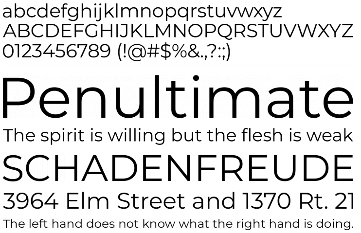
Montserrat works fine for short pieces of all caps.
Category: Sans-Serif
Pairs well with: Open Sans, Roboto Slab, and Lora
Design recommendations: Try 30px for headers and 16px for regular content
Source: Google Fonts
5. Avenir
The word avenir is French for "future". The family takes inspiration from the geometric style of sans-serif typeface developed in the 1920s that took the circle as a basis, such as Erbar and Futura.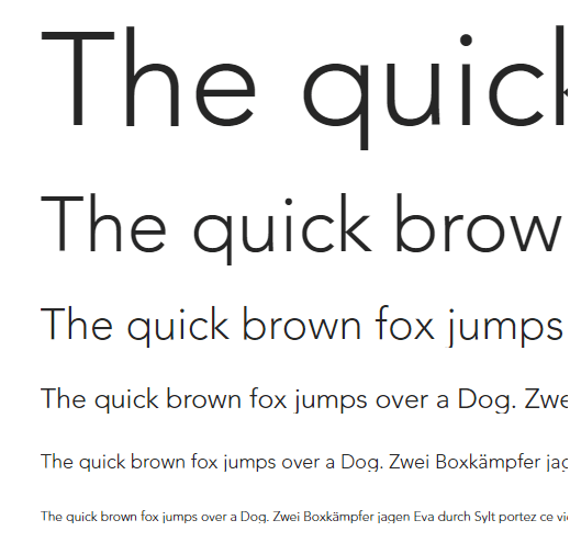
Category: Sans-Serif
Pairs well with: Minion, Georgia, Helvetica
Design recommendations: Try 30px for headers and 14px for regular content
Source: Fonts.com