8 Tips for Dark Theme Design
Dark theme is one of the most requested features over the past few years. Both Apple and Google made a dark theme an essential part of UI. Dark theme's reduced luminance provides safety in dark environments and can minimize eye strain.
Here are 8 tips to remember when designing a dark theme for your product.
1. Avoid pure black
A dark theme doesn't have to be pure white text on a pure black background. In fact, that high contrast can be painful to look at.
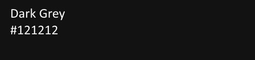
It's safer to use dark gray as the primary surface color for components, rather than true black (#000000). Dark gray surfaces reduce eye strain - light text on a dark gray surface has less contrast than light text on a black surface. Dark gray surfaces can express a wider range of color, elevation, and depth because it's easier to see shadows on gray (instead of a true black).
Material design recommends #121212 as dark theme surface color.
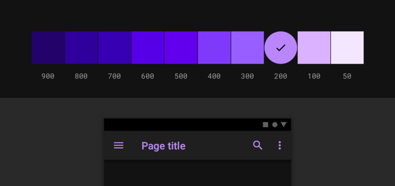
2. Avoid using saturated colors on dark themes
Saturated colors which can look great on light surfaces, can visually vibrate against dark surfaces, making them harder to read. Desaturate primary colors in order to make the contrast enough against the dark surface.
Use lighter tones (colors in the 200–50 range) because they have better readability on dark theme surfaces. Lighter variants won't make the UI less expressive but they help you maintain appropriate contrast without causing eye strain.

3. Meet accessibility color contrast standards
Ensure that your content remains comfortably legible in Dark Mode. Dark theme surfaces must be dark enough to display white text. Google Material Design recommends using a contrast level of at least 15.8:1 between text and the background.
Use color contrast tools to test contrast ratio.
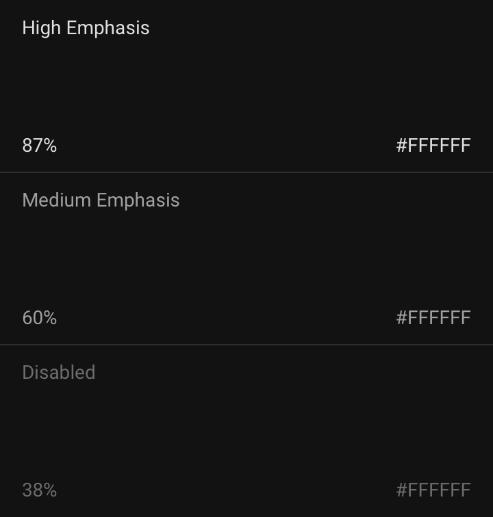
4. Use "On" colors for text
"On" colors are colors that appear "on" top of components and key surfaces. They are typically used for text.
The default "on" colors for a dark theme is pure white (#FFFFFF). But #FFFFFF is a bright color and it would visually "vibrate" against dark backgrounds. That's why Google Material design recommends using a slightly darker white:
- High-emphasis text should have an opacity of 87%
- Medium emphasis text is applied at 60%
- Disabled text uses an opacity of 38%.
Quick tip: Light text on a dark background can appear more bold than dark on light. That's why you may want to use lighter font weights for dark mode.
5. Consider the emotional aspect of your design
When it comes to designing a dark theme for an existing app, you probably want to communicate the same spectrum of emotions in dark mode. But it's better not to do it. Why? Because colors are actually perceived differently depending on their background.
That means a dark theme just can't communicate the same as the light theme. As a result, dark and light themes will always evoke different emotions. Instead of trying to fix that, it's much better to take advantage of that for your product's identity.
A dark mode does not (always) have to be derived from the existing light theme.
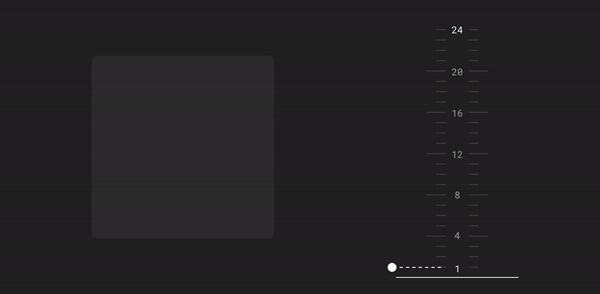
6. Communicate depth
Similar to light theme design, when it comes to creating dark theme UI it's essential to create hierarchy and emphasize important elements in your layout.
Elevation is a tool we use to communicate the hierarchy of elements.
In light mode, we use shadows to express elevation. The higher surface gets, the wider a shadow it casts. The same approach wouldn't work in a dark theme - it's hard to see a shadow against a dark background. It's better to illuminate the surface of each level. In dark themes built with Material, elevated surfaces and components are colored using overlays. The higher a surface's elevation, the lighter that surface becomes.
Higher elevation, lighter surface
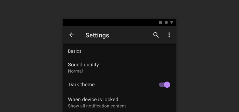
7. Allow users to switch from regular to the dark mode
It's tempting to let the system decide when to on or off dark theme. However, this design decision can lead to bad UX. By doing that you're taking control from the user and make the system decide for them.
That's why it's better not to use auto-enabling a dark theme. Allow users to turn dark theme on (or off) using UI control. Users should be able to opt into a mode manually, based on their own needs. You need to position and design the mode switcher.
8. Test your design in both light and dark appearances
See how your UI looks in both appearances, and adjust your designs as needed to accommodate each one. Consider testing your product after sundown, with incandescent lighting.
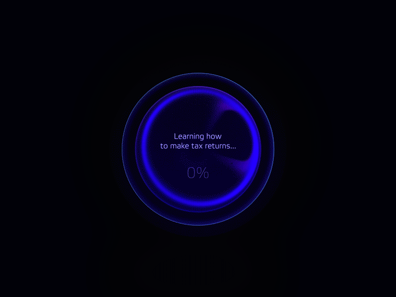
Header Image: Natural OS dark theme for AGI learning loader by Gleb Kuznetsov✈