
How To Design Smooth Checkout Experience
When was the last time when you visited an online store, put some products in a cart, but never completed the purchase? I bet not so long ago. Such behavior is known as abandonment and according to Baymard Institute almost 70% of online shopping carts are abandoned.
While many factors affect conversion rate, design of the checkout page has a tremendous impact on the number of purchases because this page allows users to review their order before completing their purchase. A poorly designed checkout page will increase the chances of cart abandonment.
In this article, we will review 5 essential design decisions that will help you design good experience on this step.
1. Guest checkout
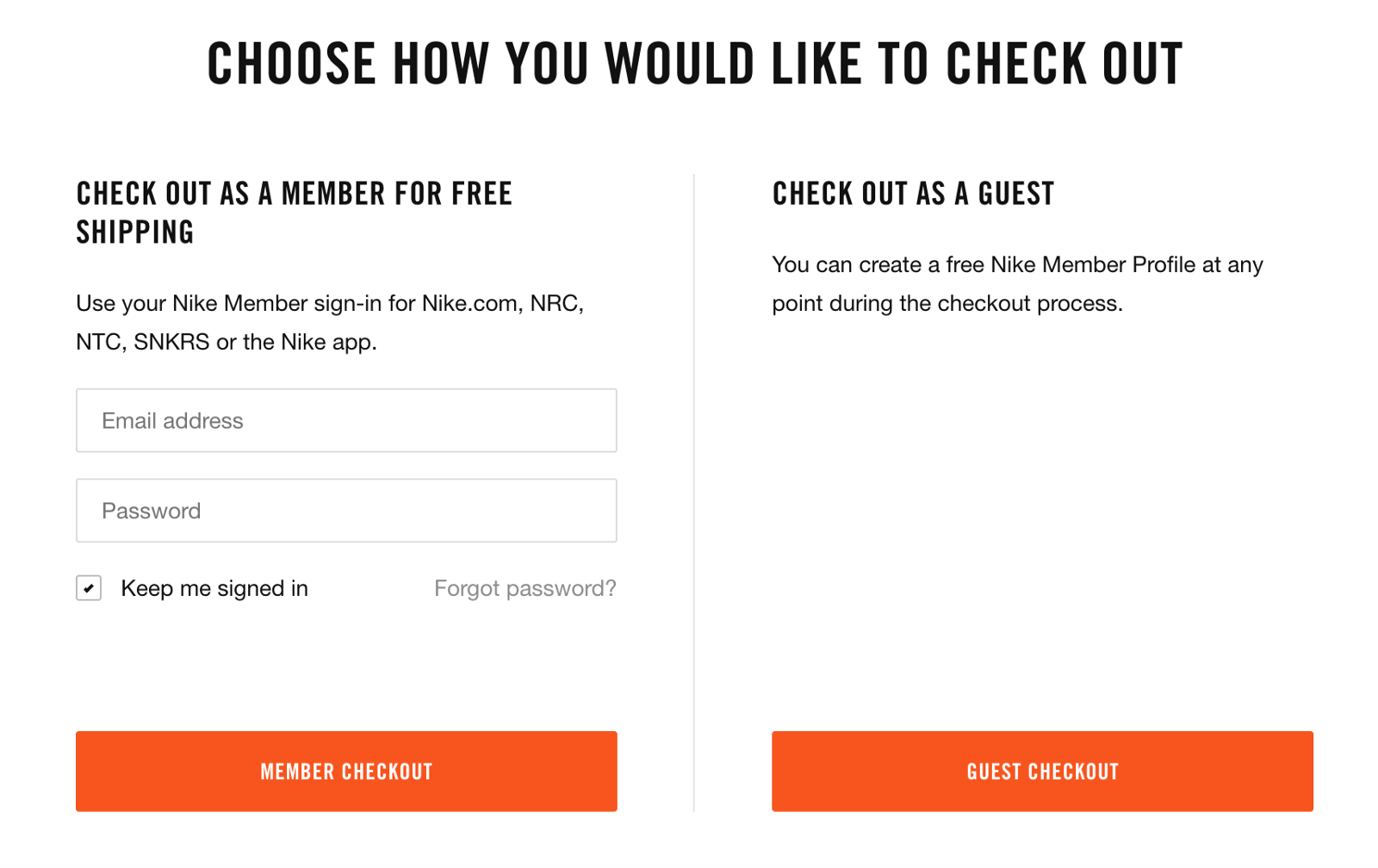
Lack of guest checkout is still a problem in 2020. Creating a new account requires an extra effort (type email/phone number, create a password that will match the security rules, and finally validate an email or phone number). Some users don't want to create an account (especially if its one-time purchase), and without guest checkout, you significantly increase the likelihood that they abandon their cart. According to the Baymard Institute, in 2020 we still have 18% of websites that don't offer this option and force visitors to create an account.
It's vital not only to provide guest checkout but also make to this option visually prominent. Do not hide guest checkout behind small text links that users will barely notice.
2. Product information
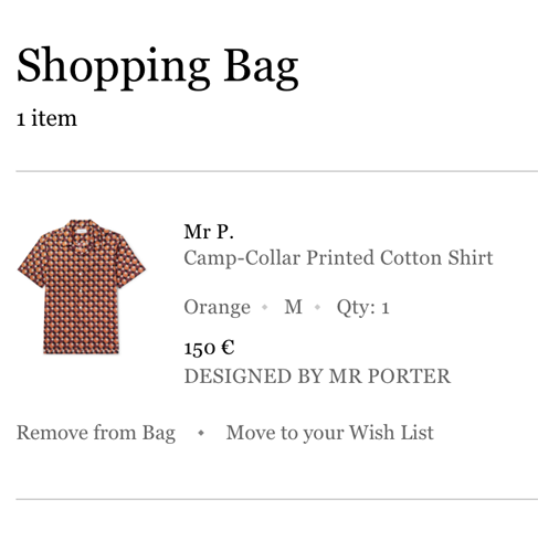
It's possible to define a few essential elements of product information such as:
- Product image
- Product name
- Product attributes or specification
- Product quantity
- Product price
Product image
Our brain process visual information much faster than text. And when we scan items in our product cart, the first thing we notice is pictures of our products. Large product images will help customers to quickly review products they have in a cart to ensure that the cart is valid.
Product name
When it comes to the product name, you need to provide only essential information about the product. For example, for clothing it can be a brand name+product name. The key idea is to help users quickly match the product image with the actual item they have in a cart. All additional information can be provided in product attributes.
Product attributes or specification
Essential product details such as product code, size, color, should be visible in a short description. Such details will reassure users that they have the right products in a cart.
Quantity
It should be evident for users how many items of a particular product they have in the cart. The quantity should be editable.
Price
When it comes to the price of a particular product, you need to keep two things into account:
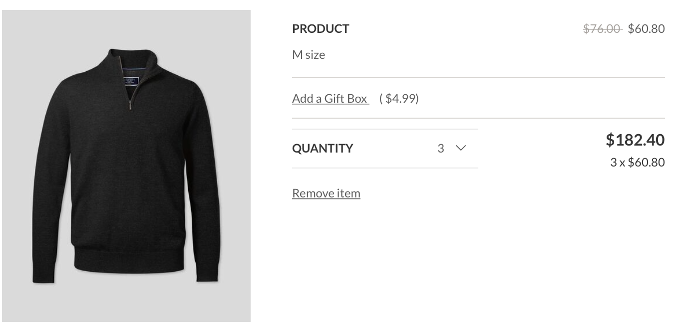
- If you have more then one item of a product in cart, you need to show price per item + subtotal for this product.
- Always show price including taxes.
3. Shipping information and cost
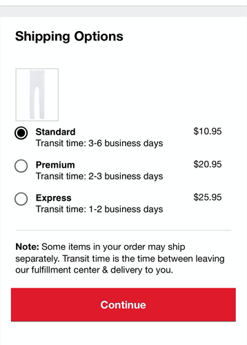
Clearly mention shipping costs
Hidden shipping costs are one of the reasons why visitors abandon the checkout process.
Low-cost shipping option is pre-selected by default
If you offer multiple shipping options, use the least expensive option as a default but always allow users to modify this selection.
Expected delivery date is provided
"When will I receive my order?" is a typical question during checkout. All too often, eCommerce websites provide vague descriptions for shipping such as "Standard (Regular)" or "Express (Fast)" The problem with this description is that it doesn't say much to users. When the user sees information about the expected date, this information makes it easier to make a decision. If you can, provide a precise delivery date, but if you cannot grantee it, at least say "delivery time is 5 days."
4. Cart summary
Subtotal and total
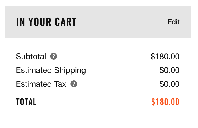
People are very careful when it comes to money. Thus, when the checkout page doesn't tell users how much money they are going spend, they are less motivated to commit to the purchase. That's why it's critical to show the order total cost. Never make users calculate the total because it will hurt your conversion rate.
If users need to pay taxes, tell them that up front. Provide an information on how the tax was calculated.
Discount
If the user can enter promo code, let them do it on the cart review step. Many users can leave a website to search for a promo code and will never return. Thus, in order to mitigate such behavior, you can offer promo code right on the website.

When the user successfully applied the promo code:
- Show the fact that promo code is applied.
- Show how much money the user can save (if the amount is more than zero).
5. Essential actions
Remove a particular product
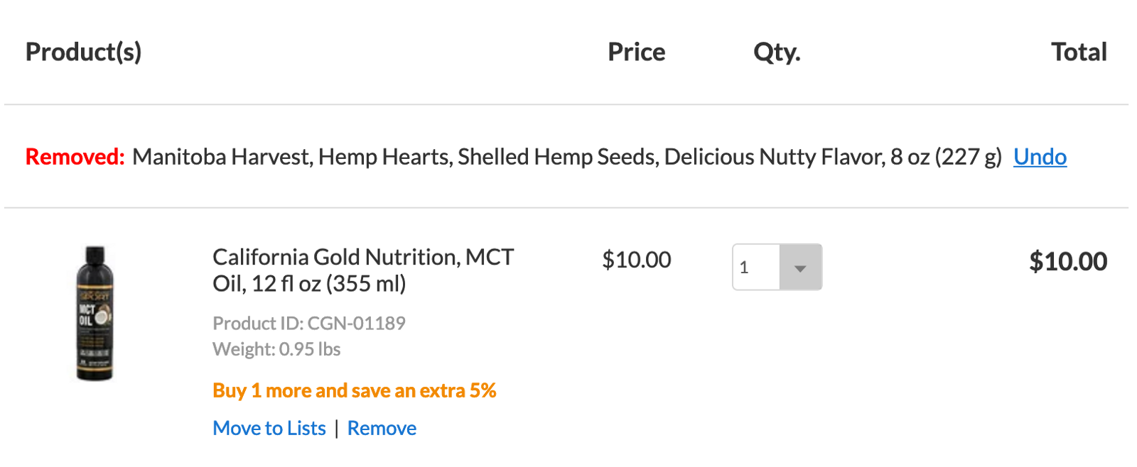
Allow users to edit products in a cart. Sometimes users want to return just deleted product back to the cart. Thus, it's worth providing an Undo action that will re-add just removed product back to the cart.
Save cart
Sometimes users are not be able to complete their order within a single session. They need some time to think or discuss products with their friends or family. For this particular scenario, you should have an option 'save cart' that will allow users to return to the cart from a perioud of time.
Email my cart
This option comes handy for cases when users want to continue checkout on other device. For example, users add products to the cart from mobile device, but want to complete order on desktop.