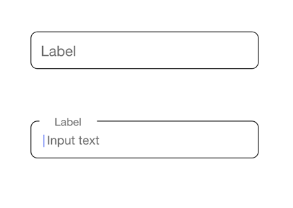
The Anatomy of Input Field
In this article, I want to talk about one of the most commonly used elements of UI design - input field. Input fields allow users to enter text into a UI. They typically appear in forms and dialogs.
Below you will find the elements of the input field along with the practical rules on how to design them.
Input fields parts
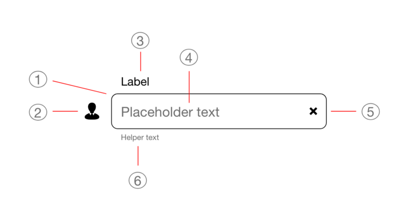
- Container
- Leading icon (Optional element)
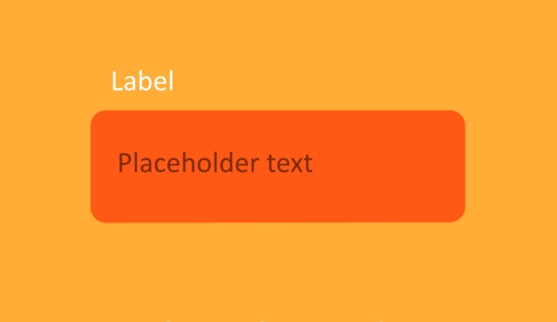
- Label
- Placeholder/Input text
- Trailing icon (Optional element)
- Helper text/Error text (Optional element)
1. Container
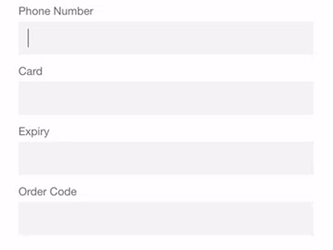
The size of the container should be proportional to the expected user input
In single-line fields, as the cursor reaches the right field edge, text longer than the input line automatically scrolls left. The more text is hidden from the user's eyes, the harder it becomes for them to validate the input. Ideally, the user should see all her input without the need to scroll the input field.
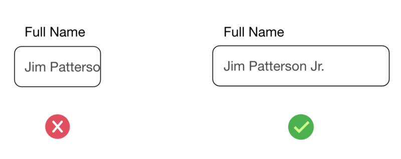
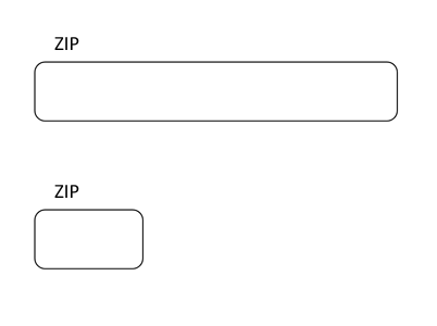
Field width also sets user expectations - it communicates how much input is required. For example, if you have an input field for ZIP in your form and you know that ZIP should have 5 digits, it's better not to make the field too width.
The container should be easily discoverable
Input fields should stand out and indicate that users can input information. There should be sufficient contrast between the container and the surrounding area.
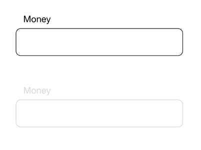
Users should understand the state of the field in a glance
Input text fields can have one of the following states: default, focused, error, and disabled. All states should be clearly differentiated from one another.
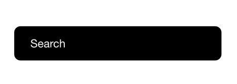
Don't design text fields to look similar to buttons
Visual appearance of UI elements plays a key role in the process of decoding its meaning. The way the object looks give the users an idea of how they suppose to interact with it. That's why it's vital to make input fields look like input fields, not buttons or any other UI elements.
Select visual style for your container based on your app aesthetics Should I use rounded corners or square corners for the container? There is no one-fits-all answer to this question. Always go for one that works best with your app's visual style.
2. Leading icon
While the leading icon is an optional element in some cases it's possible to create better user experience by introducing a relevant icon next to the input box. The properly selected icon helps users understand the meaning of the field in a glance (users won't need to read a label).
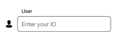
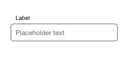
3. Label text
Label text is used to inform users as to what information is requested for a text field. Every text field should have a label.
Clear labels
The ultimate purpose of labels is to help users understand what information is required in one glance. Thus, always try to write crisp and clear labels.
Number of Words
Labels are not help texts. Avoid long labels; use succinct, short and descriptive labels (a word or two) so users can quickly scan your form.
Label text should always be visible
There are two commonly used approaches for label text:
Top-aligned label - the label located near the top of the container.
Floating label. The label goes on top of the container when the user interacts with a field.
Both approaches are good in terms of UX, and you should select the one that works the best with your style.
Label text shouldn't be truncated
Users will need to spend extra time decoding the meaning of the truncated labels.
Label text shouldn't take up multiple lines
If you need to provide additional information in the context of a field, consider using Helper text (see section 7).
4. Placeholder/Input text
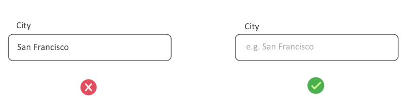
Placeholder is the text that users see before they interact with a field. Input text is the text the user has entered into a text field.Be careful with placeholder text and its contrast
It's important to select the right text for placeholder. For instance, if you ask a user to provide a city, don't use the city name as a placeholder. It will mislead users to think the placeholder text is an entry.
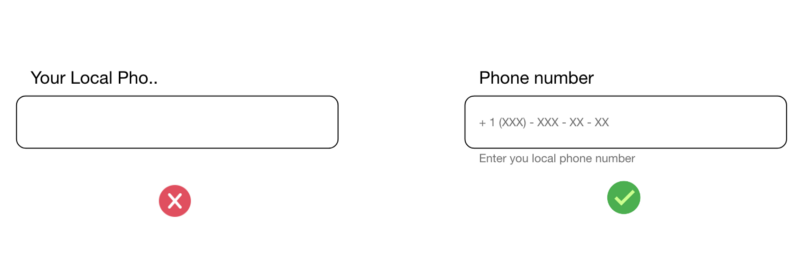
Provide input format when necessary
Don't make the user guess what format they should use for the field. Tell this information up front.
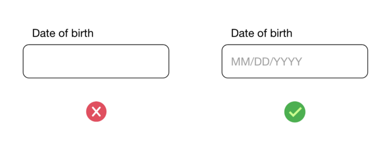
In some cases, it's better to use auto-formatting - the field adjusts the information that users provide automatically (according to the format). It makes it much easier to validate the information in a form.
Focussed state
You need to highlight the active field using visual.
Always show a cursor when the field is active. A cursor should indicate the current user's position in the field. It prevents users from unnecessary operations.
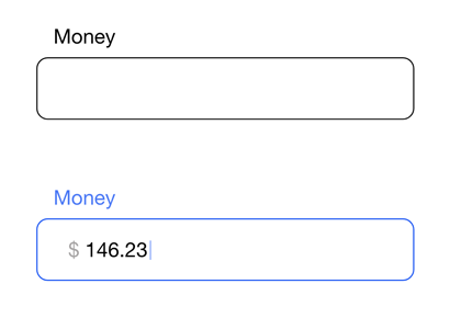
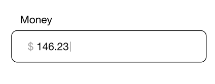
Provide prefix/suffix
Prefix and suffix work well when the field has a certain measure. For instance, the input field for the amount of money (prefix or suffix can indicate currency) or weight (suffix can indicate a unit of mass).
Setting default values
It's better to avoid static defaults unless you are absolutely sure that a large portion of your user's (say, 95%) will select a particular value. Especially if the information from this field is important to you. Why? Because people scan forms quickly and many will ignore the field that already has a value.
The only exception to this rule is a smart default. Smart defaults can make the user's completion of the form faster and more accurate. For example, pre-select the user's country based on their geolocation data. But still, you should use these with caution, because users tend to leave pre-selected fields as they are.
5. Trailing icon
Trailing icon is a small icon that has great power - it can help reduce the interaction cost.
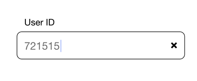
'Clear' trailing icon
Show this icon to help users erase the text in the field in one tap.
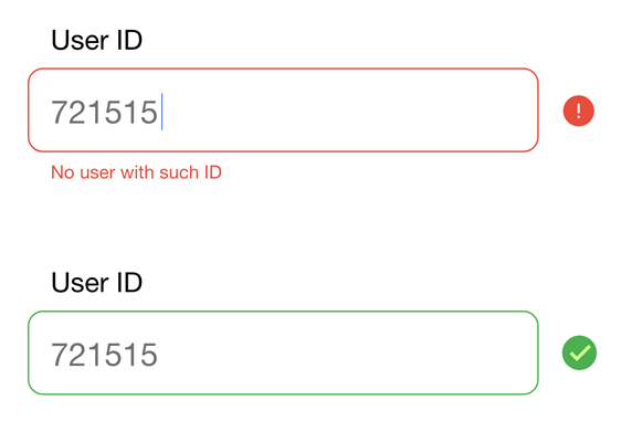
'Cross' or 'Check' icons
If you form uses inline validation, you can use a trailing icon to notify users about valid/invalid input.
When the user provides incorrect information, you can also show an error message. An error message should be displayed underneath the container. Error messages should be visible until the error is fixed.
Side note: Good error message should not just state the fact that user input is invalid; it should provide contextual instructions on how to fix the problem.
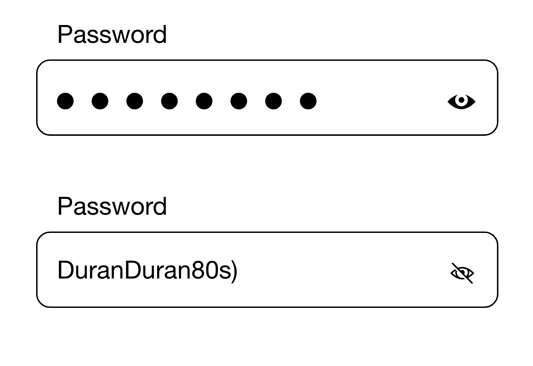
Eye icon
For the input field that collect passwords, you can show the 'eye' icon to allow users to see what they typed.
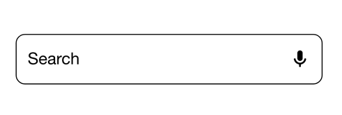
Voice input icon
A microphone icon signifies that users can voice input is available for users.
6. Helper text /Error text
Helper text acts as an assistive element - it provides additional information about the input field such as:
- How the information that the user provides will be used.
- Requirements for the information (i.e. password setting guidelines)
In some cases, helper text can be swapped with error text that will guide users (i.e. error message that user sees when they provide incorrect input).
Helper text can be multiline
Long messages can wrap to multiple lines if there isn't enough space to clearly describe the context.