
Toggle Switch: Six Design Inspirations
Toggle switches are common UI control in digital interfaces. They allow users to choose between two mutually exclusive options, and the one option should always enabled by default. Toggle switches are best used for changing system settings and user preferences.
Below are six excellent examples of toggle switches.
1. Boolean Switch
This concept is based on boolean logic (0 and 1): zero means disabled, one means enabled. Color makes the state change more obvious.

2. Fluid Switch
This example features one interesting visual design decision. The switch looks like a fluid object that travels between the states and this immediately creates a connection.
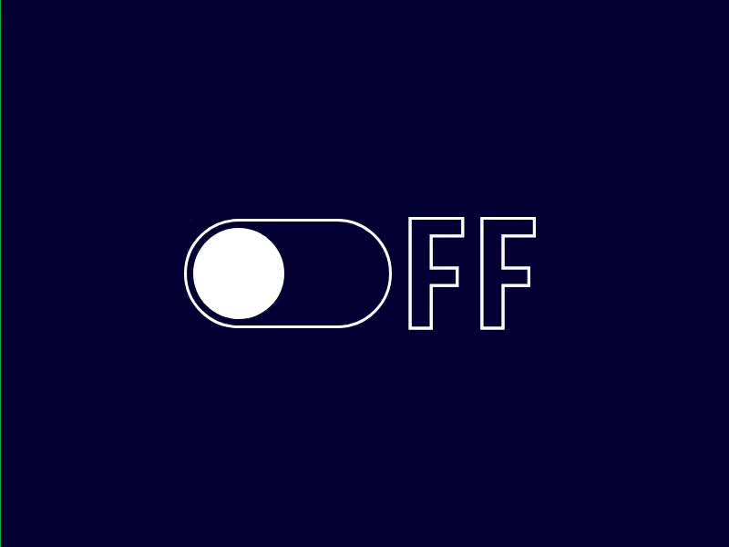
3. O/FF O/N
This design uses a shape of the toggle and appends "n/ff" to the end. Color plays a vital role in this design. High-contrast colors make it easier for users to know whether a toggle is on or off.
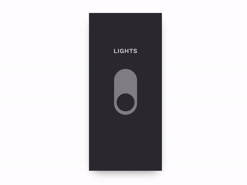
4. Light Switch
This design takes the concept of real-world light swither. In real apps, we can use it to allow users to change UI from dark to light.
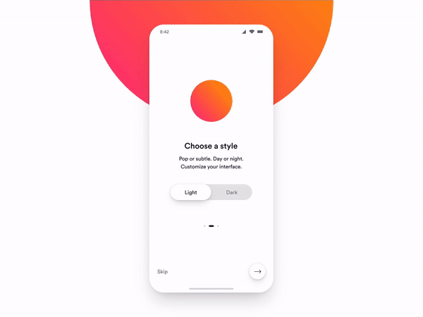
5. Light / Dark Toggle Switch
Another solution for customizing UI appearance. This concept uses clear labels 'Light' and 'Dark' to show the states.
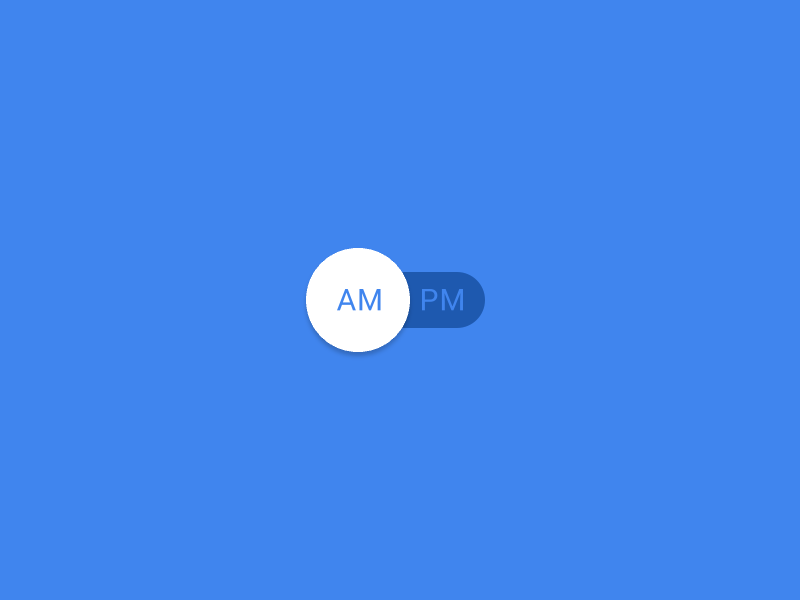
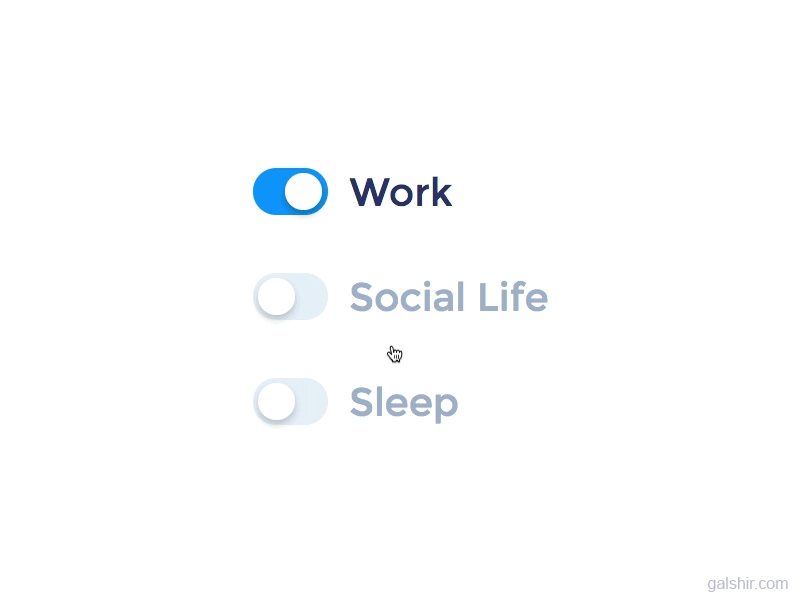
6. Mutually Exclusive Options
When turning a particular option ON, UI provides immediate results by changing the state of other switches that depend on the user. Notice that disabled options have gray text.
A Quick UX Reminder
If you plan to use toggles in your design, remember that you should strive to match the system to the real world. In real world, toggle switches always take immediate effect. When people turn the light on, they use only one control for that (light switch). That's why the users should not need to click the Save/Submit button to apply a new state. If immediate results are not achievable for some reasons (i.e. user needs to validate new settings), consider using different UI controls.